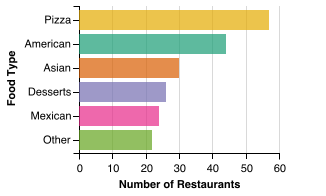
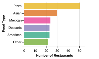
San Francisco's most popular drunk food is Pizza. For independent restaurants, the top drunk food is also Pizza.


Drunk Food Analysis
It's 1 AM on a Saturday night and you're looking for food. If you're not pregnant, you're probably drunk :) This project compares the drunk food scenes in North America's biggest cities. The analysis used Yelp to find low cost restaurants open at 1:15 a.m. Saturday, September 09, 2017. Not every restaurant has accurate hours in Yelp, so this data isn't perfect. You can see more details in the About page. You can also check out the overview of all cities.
City Drunk Food Rankings
How does the drunk food scene in San Francisco stack up to the rest of North America?
| Number of restaurants | 203 | (13/57) |
| Number of independent restaurants | 173 | (8/57) |
| Percentage of independent restaurants | 85.2% | (4/57) |
| Restaurants per 10,000 residents | 2.3 | (17/57) |
San Francisco has 203 drunk food restaurants, ranking it number 13 out of all 57 cities included. The city with the most drunk food restaurants is New York with 1077. San Francisco ranks as the number 4 city in terms of independent drunk food, with 85.2% of the drunk food restaurants being independent.
With a population of 864,816 San Francisco has 2.3 drunk food restaurants for every 10,000 residents. Las Vegas has the most drunk food restaurants per person with 9.3 for every 10,000 residents.
Food Categories
These two graphs show the most popular food categories for late night drunk food in San Francisco. To get this category break down, the smaller Yelp categories were combined into a few big categories. For example, Japanese, Ramen and Sushi all fall under the 'Asian' category. The first graph shows food categories across all restaurants in the city (including chains), the second shows only independent restaurants.
All Restaurant Breakdown
Independent Restaurant Breakdown
Restaurant Category Variety
The graph below gives a sense of the variety of drunk food in San Francisco. Appearing in the top right indicates higher variety.
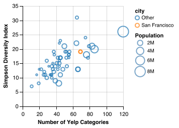
There's a lot going on in this graph, here's how to read it:
- Circle Size: Each city's circle represents its population. The larger the circle, the higher the population.
- Horizontal Axis: The number of Yelp categories found. The more restaurant food categories there are, the further to the right San Francisco appears in the graph.
- Vertical Axis: How evenly distributed the restaurants are over all the categories. If there's an equal number of restaurants for each category, the city will appear higher in the plot. (I measured this using Simpson Diversity Index.)